icons before redesign
Blum Facelift
Icons Redesign
12/2021
overview
Problem
The previous icons look very different – especially in terms of size, stroke width and style. Therefore, they did not result in a harmonious visual language. 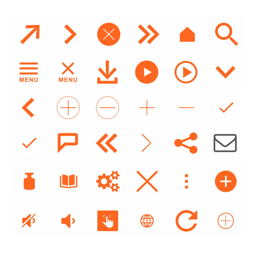
Solution
So I established a grid system for icons, according to which all new icons are getting created. Some icons got matched into the new grid system, others got completely redesigned. A few icons needed to be invented for special cases. 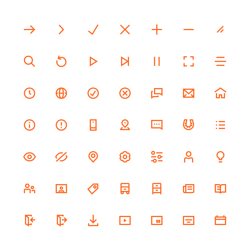
icons after redesign
established icon grid